Modern biology generates datasets with many variables: gene expression across thousands of genes, metabolomic profiles with hundreds of compounds, morphological measurements on many traits. When datasets have many variables, visualization becomes challenging and statistical analysis becomes complicated.
A typical machine learning challenge might include hundreds or thousands of predictors. For example, to compare each of the 784 features in a digit recognition problem, we would need to create 306,936 scatterplots! Creating a single scatter-plot of all the data is impossible due to the high dimensionality.
Dimensionality reduction creates a smaller set of new variables that capture most of the information in the original data. The general idea is to reduce the dimension of the dataset while preserving important characteristics, such as the distance between features or observations. These techniques help us:
Visualize high-dimensional data in 2D or 3D
Identify patterns and clusters
Remove noise and redundancy
Reduce complexity of downstream models
Create composite variables for analysis
37.2 Principal Component Analysis (PCA)
Principal Component Analysis (PCA)(Pearson 1901; Hotelling 1933) is the most widely used dimensionality reduction technique. It finds new variables (principal components) that are linear combinations of the originals, chosen to capture maximum variance. The technique behind it—the singular value decomposition—is also useful in many other contexts.
Intuition: Preserving Distance
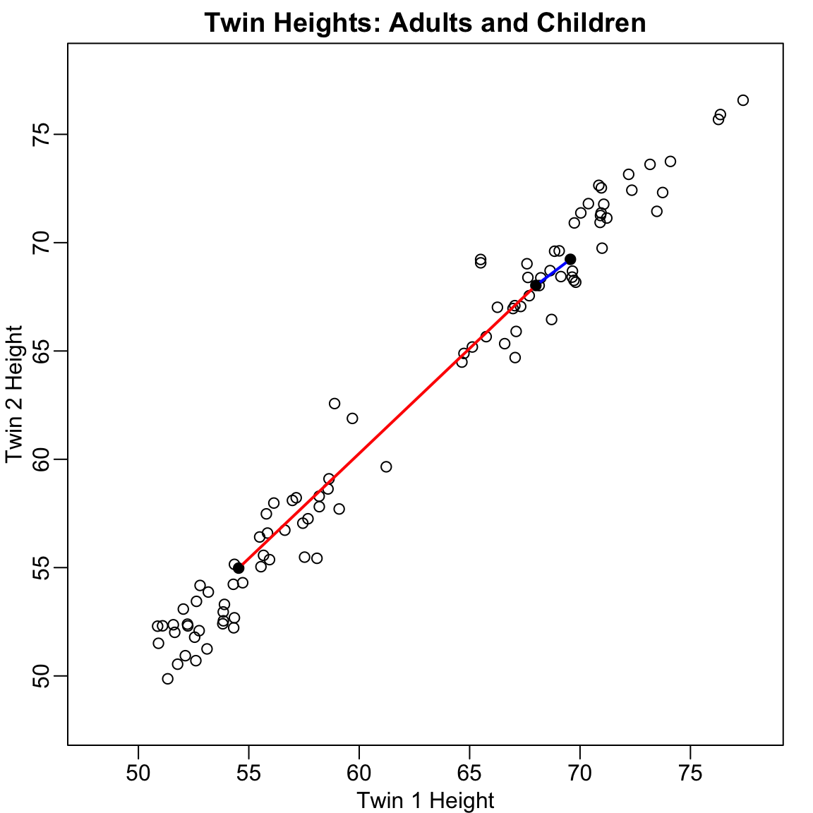
Before diving into the mathematics, let’s build intuition with a simple example. Consider twin heights data where we have height measurements for 100 pairs of twins—some adults, some children.
Figure 37.1: Simulated twin heights showing two groups (adults and children) with high correlation between twins
The scatterplot reveals high correlation and two clear groups: adults (upper right) and children (lower left). We can compute distances between observations:
Code
d <-dist(x)cat("Distance between observations 1 and 2:", round(as.matrix(d)[1, 2], 2), "\n")
Distance between observations 1 and 2: 1.98
Code
cat("Distance between observations 2 and 51:", round(as.matrix(d)[2, 51], 2), "\n")
Distance between observations 2 and 51: 18.74
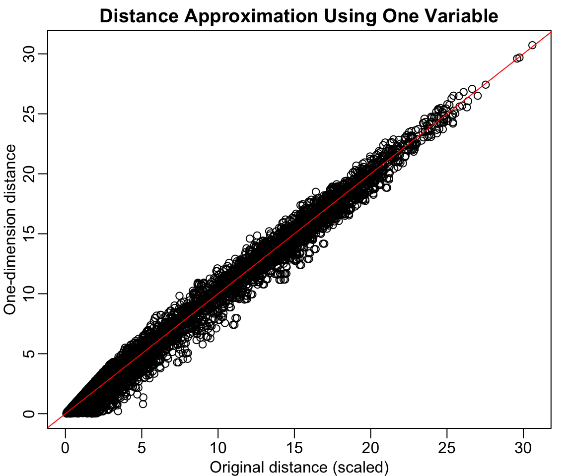
Now suppose we want to reduce from two dimensions to one while preserving these distances. A naive approach is to simply use one of the original variables:
Code
z <- x[, 1]rafalib::mypar()plot(dist(x) /sqrt(2), dist(z),xlab ="Original distance (scaled)", ylab ="One-dimension distance",main ="Distance Approximation Using One Variable")abline(0, 1, col ="red")
Figure 37.2: Using only one dimension (Twin 1 height) underestimates the true distances
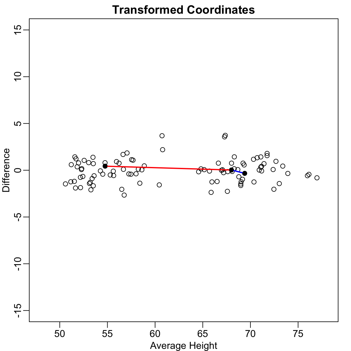
This works reasonably well, but we can do better. Notice that the variation in the data lies mostly along the diagonal. If we transform to the average and difference:
Figure 37.3: After rotating to average and difference coordinates, distances are mostly explained by the first dimension
Now the distances are mostly explained by the first dimension (the average). Using just this one dimension gives better distance approximation:
Code
cat("Typical error with original variable:",round(sd(dist(x) -dist(x[, 1]) *sqrt(2)), 2), "\n")
Typical error with original variable: 1.21
Code
cat("Typical error with average:",round(sd(dist(x) -dist(z[, 1]) *sqrt(2)), 2), "\n")
Typical error with average: 0.32
The average of the twin heights is essentially the first principal component! PCA finds these optimal linear combinations automatically.
Linear Transformations
Each row of the original matrix \(X\) was transformed using a linear transformation to create \(Z\):
\[Z_{i,1} = a_{1,1} X_{i,1} + a_{2,1} X_{i,2}\]
with \(a_{1,1} = 0.5\) and \(a_{2,1} = 0.5\) (the average).
In matrix notation: \[
Z = X A
\mbox{ with }
A = \begin{pmatrix}
1/2 & 1 \\
1/2 & -1
\end{pmatrix}
\]
Dimension reduction can be described as applying a transformation \(A\) to a matrix \(X\) that moves the information to the first few columns of \(Z = XA\), then keeping just these informative columns.
Orthogonal Transformations
To preserve distances exactly, we need an orthogonal transformation—one where the columns of \(A\) have unit length and are perpendicular:
Code
# Orthogonal transformationz[, 1] <- (x[, 1] + x[, 2]) /sqrt(2)z[, 2] <- (x[, 2] - x[, 1]) /sqrt(2)# This preserves the original distances exactlycat("Maximum distance difference:", max(abs(dist(z) -dist(x))), "\n")
Maximum distance difference: 3.241851e-14
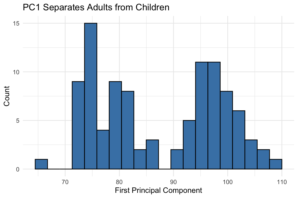
An orthogonal rotation preserves all distances while reorganizing the variance. Now most variance is in the first dimension:
Code
qplot(z[, 1], bins =20, color =I("black"), fill =I("steelblue")) +labs(x ="First Principal Component", y ="Count",title ="PC1 Separates Adults from Children")
Figure 37.4: After orthogonal rotation, the first dimension clearly separates adults from children
The first PC clearly shows the two groups. We’ve reduced two dimensions to one with minimal information loss because the original variables were highly correlated:
Code
cat("Correlation between twin heights:", round(cor(x[, 1], x[, 2]), 3), "\n")
Correlation between twin heights: 0.988
Code
cat("Correlation between PCs:", round(cor(z[, 1], z[, 2]), 3), "\n")
Correlation between PCs: 0.088
The Eigenanalysis Foundation
The mathematical foundation involves eigenanalysis: decomposing the covariance (or correlation) matrix to find directions of maximum variation. For a detailed treatment of eigenvalues, eigenvectors, and their interpretation, see Section 52.9.
Given a covariance matrix \(\Sigma\), eigenanalysis finds:
Eigenvectors: The directions of the principal components (loadings)
Eigenvalues: The variance explained by each component
The first principal component points in the direction of maximum variance. Each subsequent component is orthogonal (uncorrelated) and captures remaining variance in decreasing order.
The total variability can be defined as the sum of variances: \[
v_1 + v_2 + \cdots + v_p
\]
An orthogonal transformation preserves total variability but redistributes it. PCA finds the transformation that concentrates variance in the first few components.
Interpreting Eigenvalues and Eigenvectors
Eigenvalues tell you how much variance each PC captures—larger means more important
Eigenvectors (loadings) tell you how original variables combine to form each PC
Variables with large absolute loadings contribute strongly to that PC
The sum of all eigenvalues equals the total variance in the data
See Section 52.9.5 for a complete explanation with examples.
Figure 37.5: Geometric interpretation of principal components as directions of maximum variance
Large absolute loadings indicate that a variable strongly influences that component. The sign indicates the direction of the relationship.
Interpreting PCA Results
Key elements of PCA output:
Eigenvalues: Variance explained by each component (shown in scree plot)
Proportion of variance: How much of total variance each PC captures
Loadings: Coefficients relating original variables to PCs
Scores: Values of the new variables for each observation
The first few PCs often capture most of the meaningful variation, allowing you to reduce many variables to just 2-3 for visualization and analysis.
How Many Components to Keep?
Common approaches:
Keep components with eigenvalues > 1 (Kaiser criterion)
Keep enough to explain 80-90% of variance
Look for an “elbow” in the scree plot
Use cross-validation if using PCs for prediction
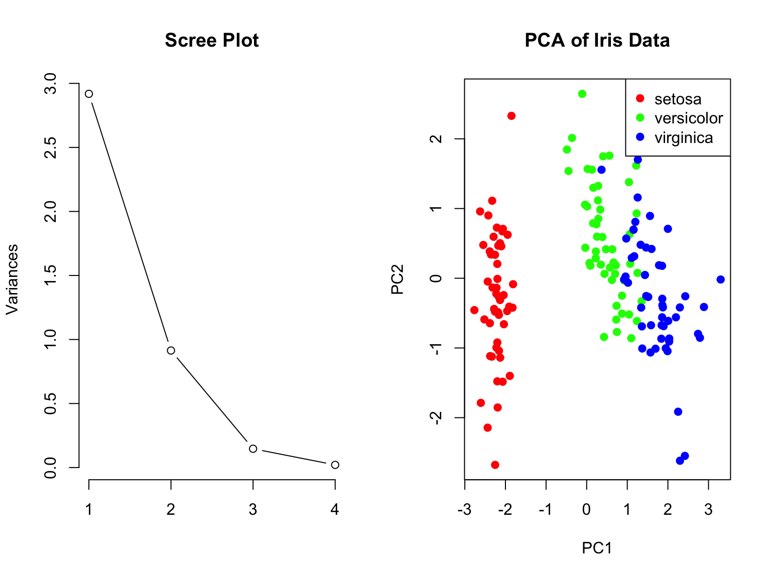
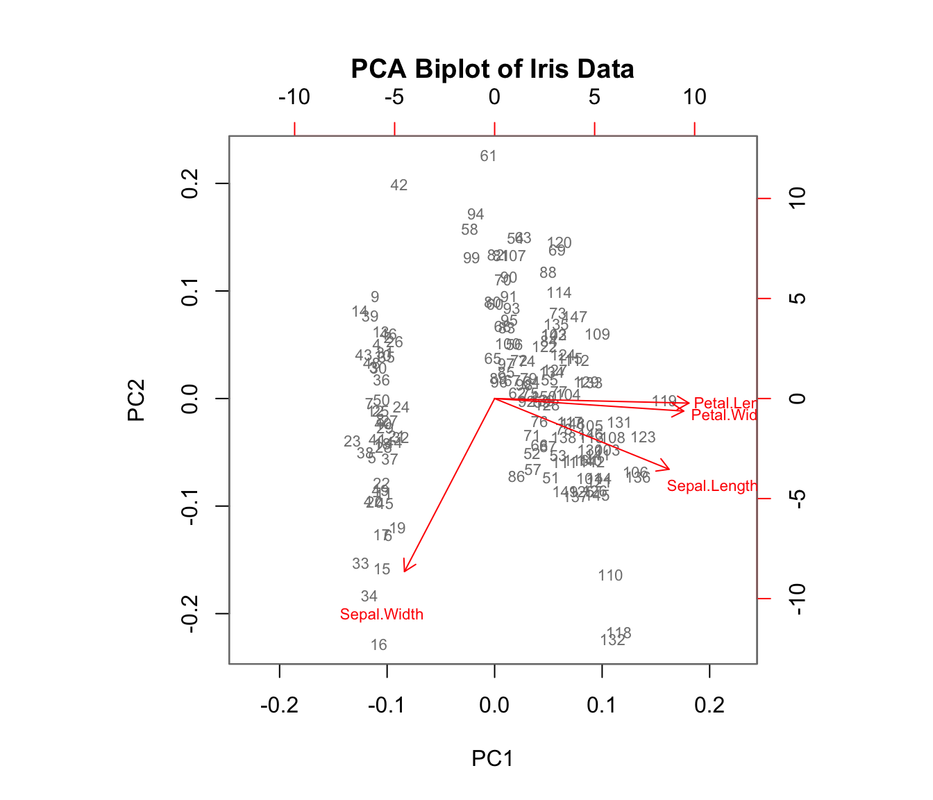
Biplot Visualization
A biplot shows both observations (scores) and variables (loadings) on the same plot:
Code
biplot(iris_pca, col =c("gray50", "red"), cex =0.7,main ="PCA Biplot of Iris Data")
Figure 37.7: PCA biplot showing both observations and variable loadings simultaneously
Arrows show variable loadings—their direction and length indicate how each variable relates to the principal components.
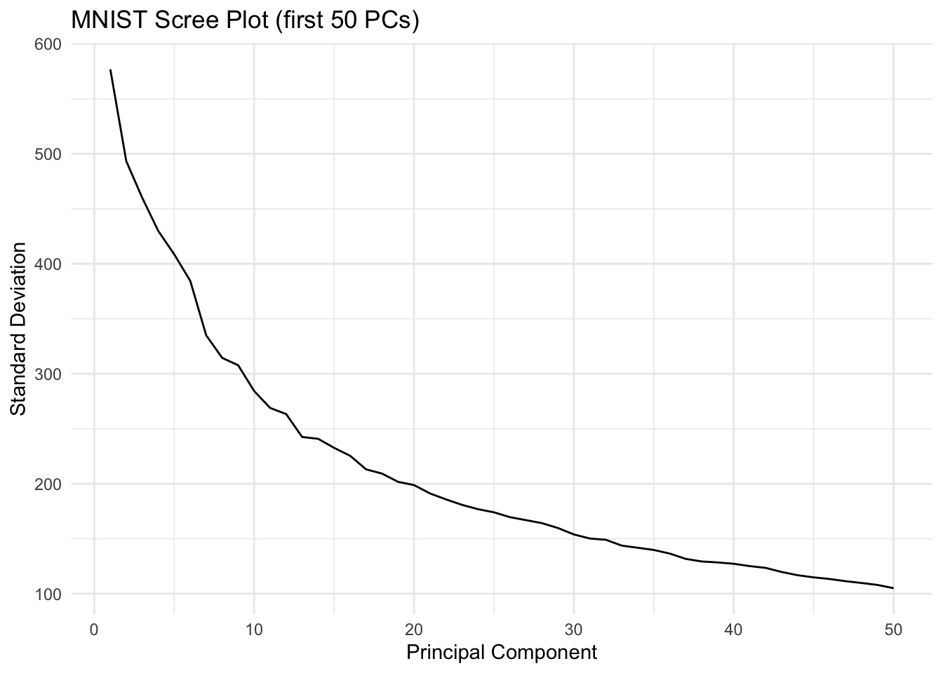
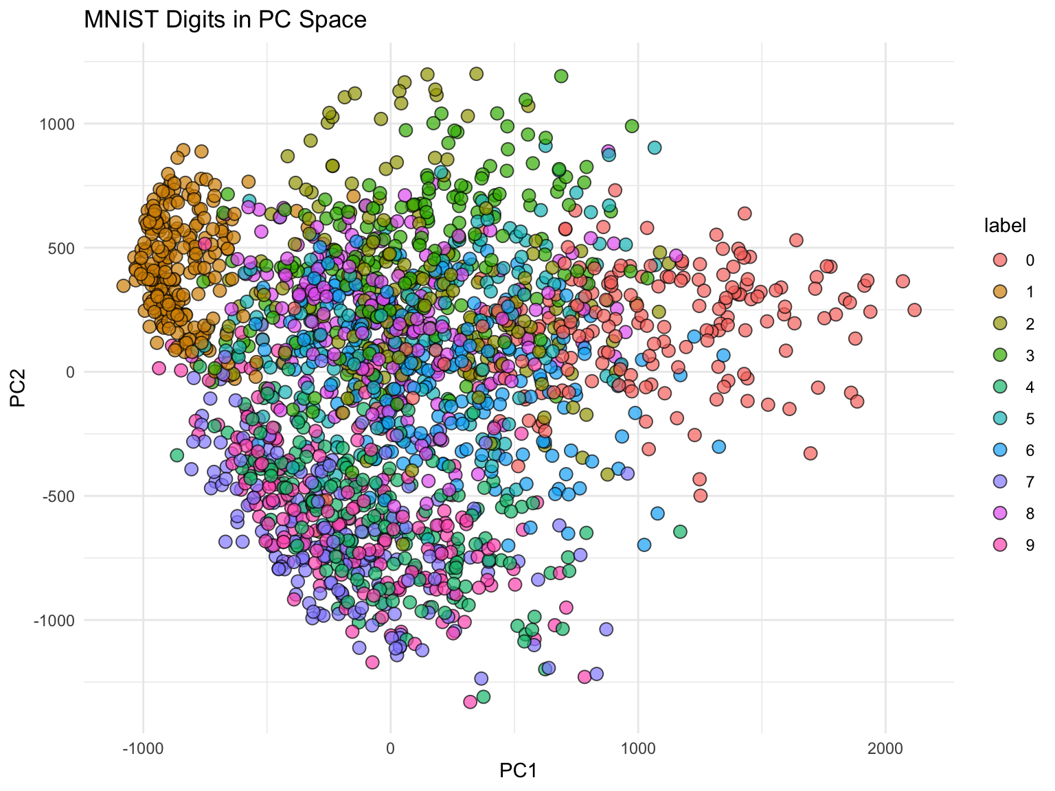
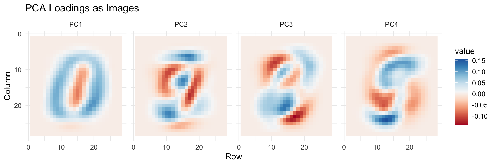
MNIST Example: High-Dimensional Image Data
The real power of PCA becomes apparent with truly high-dimensional data. The MNIST dataset of handwritten digits has 784 features (28×28 pixels). Can we reduce this dimensionality while preserving useful information?
Figure 37.10: First four principal component loadings visualized as images. Each PC captures different aspects of digit structure.
Applying PCA to Improve Classification
PCA can reduce model complexity while maintaining predictive performance. Let’s use 36 PCs (explaining ~80% of variance) for kNN classification:
Code
library(caret)k <-36x_train <- pca$x[, 1:k]y <-factor(mnist$train$labels)fit <-knn3(x_train, y)# Transform test set using training PCAx_test <-sweep(mnist$test$images, 2, col_means) %*% pca$rotationx_test <- x_test[, 1:k]# Predict and evaluatey_hat <-predict(fit, x_test, type ="class")confusionMatrix(y_hat, factor(mnist$test$labels))$overall["Accuracy"]
Accuracy
  0.9751
With just 36 dimensions (instead of 784), we achieve excellent accuracy. This demonstrates the power of PCA for both visualization and model simplification.
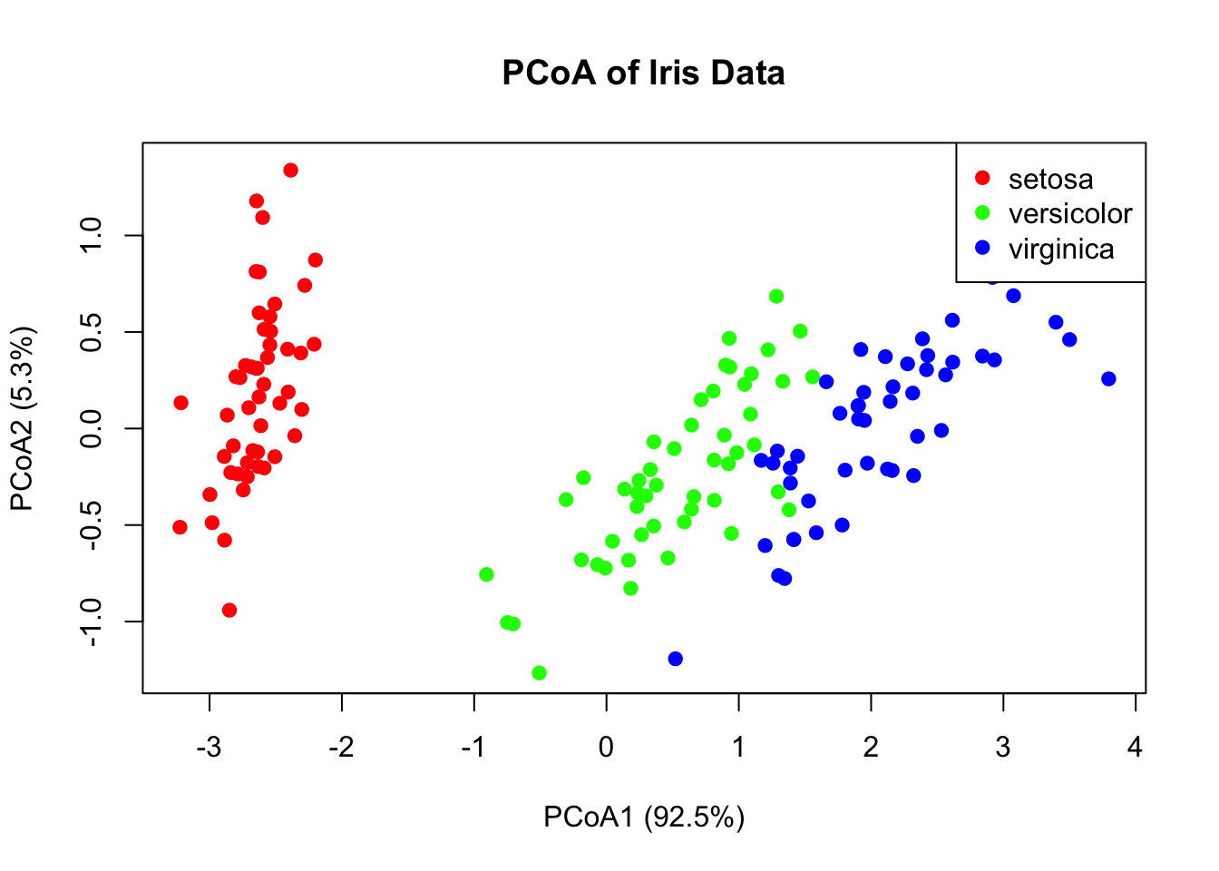
37.3 Principal Coordinate Analysis (PCoA)
While PCA uses correlations among variables, Principal Coordinate Analysis (PCoA) (also called Metric Multidimensional Scaling) starts with a dissimilarity matrix among observations. This is valuable when:
You have a meaningful distance metric (e.g., genetic distances)
Variables are mixed types or non-numeric
The data are counts (e.g., microbiome data)
Code
# PCoA example using Euclidean distancesdist_matrix <-dist(iris[, 1:4])pcoa_result <-cmdscale(dist_matrix, k =2, eig =TRUE)# Proportion of variance explainedeig_vals <- pcoa_result$eig[pcoa_result$eig >0]var_explained <- eig_vals /sum(eig_vals)cat("Variance explained by first two axes:",round(sum(var_explained[1:2]) *100, 1), "%\n")
Figure 37.11: Principal Coordinate Analysis (PCoA) ordination of iris data using Euclidean distances
When to Use PCoA vs. PCA
PCA: Variables are measured on a common scale; interested in variable contributions
PCoA: Have a distance matrix; want to preserve distances among samples
For Euclidean distances, PCA and PCoA give equivalent results
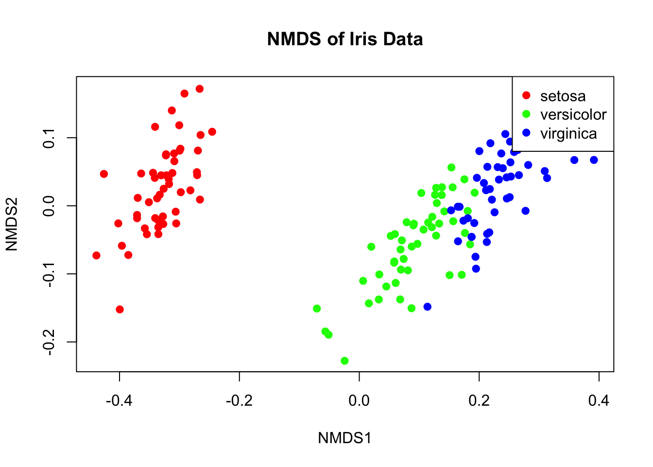
37.4 Non-Metric Multidimensional Scaling (NMDS)
NMDS is an ordination technique that preserves rank-order of distances rather than exact distances. It’s widely used in ecology because it makes no assumptions about the data distribution.
Code
# NMDS examplelibrary(vegan)nmds_result <-metaMDS(iris[, 1:4], k =2, trymax =100, trace =FALSE)# Stress value indicates fit (< 0.1 is good, < 0.2 is acceptable)cat("Stress:", round(nmds_result$stress, 3), "\n")
Figure 37.12: Non-metric multidimensional scaling (NMDS) ordination of iris data
Metric vs. Non-Metric Methods
PCA and metric PCoA produce scores on a ratio scale—differences between scores are meaningful. These can be used directly in linear models.
Non-metric multidimensional scaling (NMDS) produces ordinal rankings only. NMDS scores should not be used in parametric analyses like ANOVA or regression.
37.5 MANOVA: Multivariate Analysis of Variance
When you have multiple response variables and want to test for group differences, MANOVA (Multivariate Analysis of Variance) is the appropriate technique. It extends ANOVA to multiple dependent variables simultaneously.
Why Not Multiple ANOVAs?
Running separate ANOVAs on each variable:
Ignores correlations among response variables
Inflates Type I error rate with multiple tests
May miss differences only apparent when variables are considered together
MANOVA tests whether group centroids differ in multivariate space.
The MANOVA Framework
MANOVA decomposes the total multivariate variation:
\[\mathbf{T} = \mathbf{H} + \mathbf{E}\]
where:
T: Total sum of squares and cross-products matrix
H: Hypothesis (between-groups) matrix
E: Error (within-groups) matrix
These are matrices because we have multiple response variables.
Figure 37.13: MANOVA decomposes multivariate variation into between-group and within-group components
Test Statistics
Several test statistics exist for MANOVA, each a function of the eigenvalues of \(\mathbf{HE}^{-1}\):
Statistic
Description
Wilks’ Lambda (Λ)
Product of 1/(1+λᵢ); most commonly used
Hotelling-Lawley Trace
Sum of eigenvalues
Pillai’s Trace
Sum of λᵢ/(1+λᵢ); most robust
Roy’s Largest Root
Maximum eigenvalue; most powerful but sensitive
Pillai’s Trace is generally recommended because it’s most robust to violations of assumptions.
MANOVA in R
Code
# MANOVA on iris datamanova_model <-manova(cbind(Sepal.Length, Sepal.Width, Petal.Length, Petal.Width) ~ Species,data = iris)# Summary with different test statisticssummary(manova_model, test ="Pillai")
           Df Pillai approx F num Df den Df    Pr(>F)
Species     2 1.1919   53.466      8    290 < 2.2e-16 ***
Residuals 147
---
Signif. codes:  0 '***' 0.001 '**' 0.01 '*' 0.05 '.' 0.1 ' ' 1
Code
summary(manova_model, test ="Wilks")
           Df    Wilks approx F num Df den Df    Pr(>F)
Species     2 0.023439   199.15      8    288 < 2.2e-16 ***
Residuals 147
---
Signif. codes:  0 '***' 0.001 '**' 0.01 '*' 0.05 '.' 0.1 ' ' 1
The significant result tells us that species differ in their multivariate centroid—the combination of all four measurements.
Follow-Up Analyses
A significant MANOVA should be followed by:
Univariate ANOVAs to see which variables differ
Discriminant Function Analysis to understand how groups differ
Code
# Univariate follow-upssummary.aov(manova_model)
 Response Sepal.Length :
             Df Sum Sq Mean Sq F value    Pr(>F)
Species       2 63.212  31.606  119.26 < 2.2e-16 ***
Residuals   147 38.956   0.265
---
Signif. codes:  0 '***' 0.001 '**' 0.01 '*' 0.05 '.' 0.1 ' ' 1

 Response Sepal.Width :
             Df Sum Sq Mean Sq F value    Pr(>F)
Species       2 11.345  5.6725   49.16 < 2.2e-16 ***
Residuals   147 16.962  0.1154
---
Signif. codes:  0 '***' 0.001 '**' 0.01 '*' 0.05 '.' 0.1 ' ' 1

 Response Petal.Length :
             Df Sum Sq Mean Sq F value    Pr(>F)
Species       2 437.10 218.551  1180.2 < 2.2e-16 ***
Residuals   147  27.22   0.185
---
Signif. codes:  0 '***' 0.001 '**' 0.01 '*' 0.05 '.' 0.1 ' ' 1

 Response Petal.Width :
             Df Sum Sq Mean Sq F value    Pr(>F)
Species       2 80.413  40.207  960.01 < 2.2e-16 ***
Residuals   147  6.157   0.042
---
Signif. codes:  0 '***' 0.001 '**' 0.01 '*' 0.05 '.' 0.1 ' ' 1
MANOVA Assumptions
MANOVA assumes:
Multivariate normality within groups
Homogeneity of covariance matrices across groups
Independence of observations
No multicollinearity among response variables
Test homogeneity of covariance matrices with Box’s M test (though it’s sensitive to non-normality):
Code
# Box's M test (requires biotools package)# library(biotools)# boxM(iris[, 1:4], iris$Species)
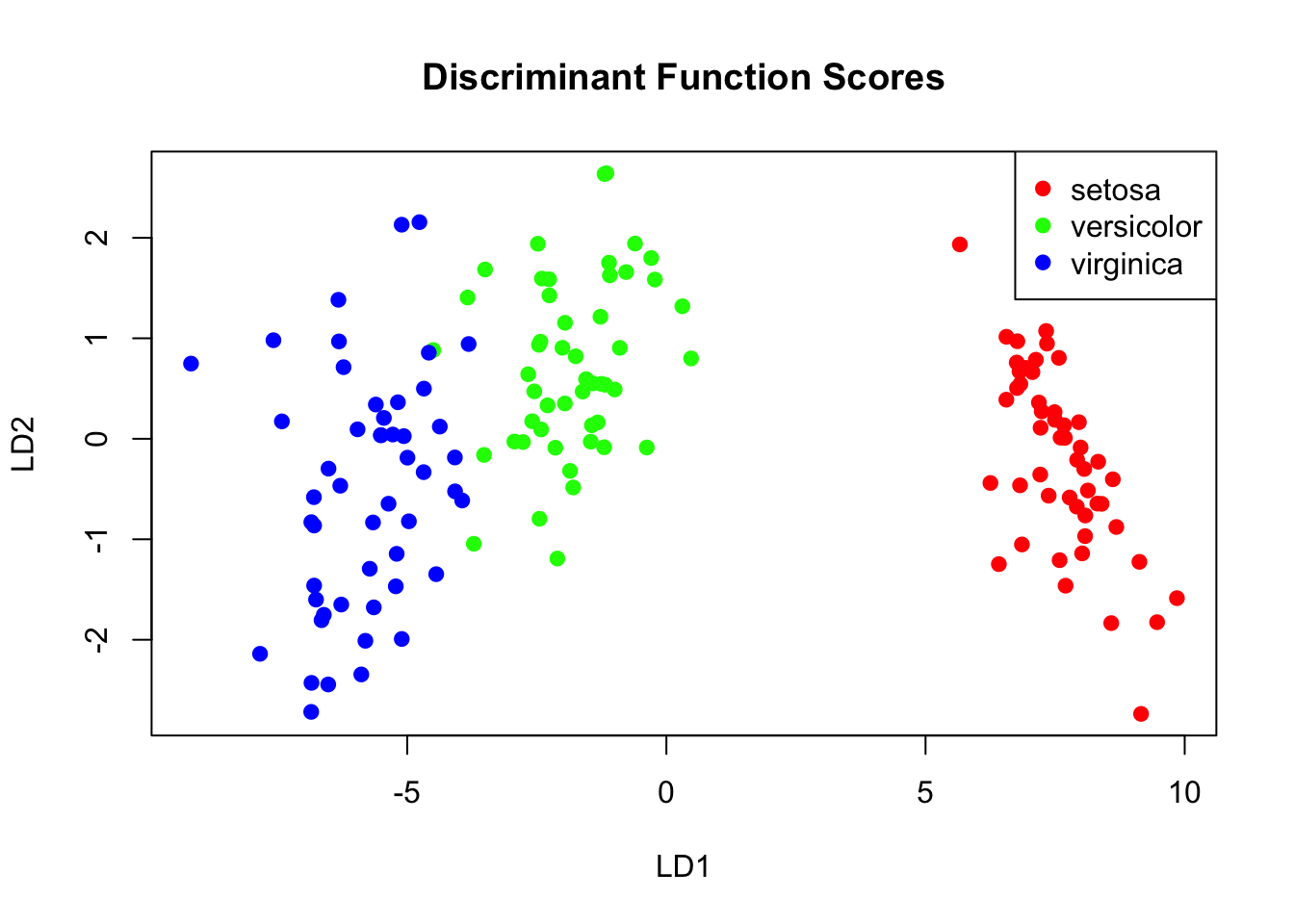
37.6 Discriminant Function Analysis (DFA)
Discriminant Function Analysis (DFA, also called Linear Discriminant Analysis or LDA) finds linear combinations of variables that best separate groups. It complements MANOVA by showing how groups differ.
The Goal of DFA
DFA finds discriminant functions—weighted combinations of original variables—that maximize separation between groups while minimizing variation within groups.
The first discriminant function captures the most separation, the second captures remaining separation orthogonal to the first, and so on.
Figure 37.14: Discriminant function analysis finds linear combinations that maximize group separation
DFA in R
Code
# Linear Discriminant Analysislda_model <-lda(Species ~ ., data = iris)# View the modellda_model
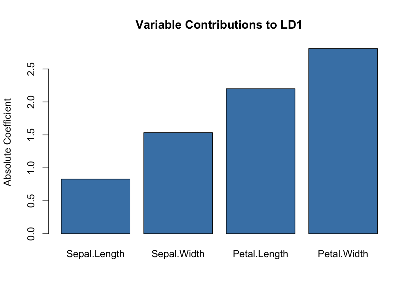
DFA is valuable for identifying which variables best distinguish groups—useful in biomarker discovery:
Code
# Which variables contribute most to separation?scaling_df <-data.frame(Variable =rownames(lda_model$scaling),LD1 =abs(lda_model$scaling[, 1]),LD2 =abs(lda_model$scaling[, 2]))barplot(scaling_df$LD1, names.arg = scaling_df$Variable,main ="Variable Contributions to LD1",ylab ="Absolute Coefficient",col ="steelblue")
Figure 37.16: Variable contributions to the first linear discriminant function
37.7 Comparing Methods
Method
Input
Output
Supervision
Best For
PCA
Variables
Continuous scores
None
Reducing correlated variables
PCoA
Distance matrix
Continuous scores
None
Preserving sample distances
NMDS
Distance matrix
Ordinal scores
None
Ecological community data
MANOVA
Variables + groups
Test statistics
Groups known
Testing group differences
DFA
Variables + groups
Discriminant scores
Groups known
Classifying observations
For clustering methods (hierarchical, k-means) that group observations based on similarity, see Chapter 36.
37.8 Using Ordination Scores in Further Analyses
PC scores and discriminant scores are legitimate new variables that can be used in downstream analysis:
Regression of scores on other continuous variables
ANOVA comparing groups on ordination scores
Correlation of scores with environmental gradients
This is valuable when you have many correlated variables and want to reduce dimensionality before hypothesis testing.
Code
# Use PC scores in ANOVApc_scores <-data.frame(PC1 = iris_pca$x[, 1],PC2 = iris_pca$x[, 2],Species = iris$Species)summary(aov(PC1 ~ Species, data = pc_scores))
             Df Sum Sq Mean Sq F value Pr(>F)
Species       2  406.4  203.21    1051 <2e-16 ***
Residuals   147   28.4    0.19
---
Signif. codes:  0 '***' 0.001 '**' 0.01 '*' 0.05 '.' 0.1 ' ' 1
37.9 Practical Workflow
Explore data: Check for outliers, missing values, scaling issues
Standardize if needed: Especially important when variables are on different scales
Choose appropriate method: Based on your data type and question
We want to get an idea of which observations are close to each other, but the predictors are 500-dimensional so plotting is difficult. Plot the first two principal components with color representing tissue type.
The predictors for each observation are measured on the same device and experimental procedure. This introduces biases that can affect all the predictors from one observation. For each observation, compute the average across all predictors and then plot this against the first PC with color representing tissue. Report the correlation.
We see an association with the first PC and the observation averages. Redo the PCA but only after removing the center (row means).
For the first 10 PCs, make a boxplot showing the values for each tissue.
Plot the percent variance explained by PC number. Hint: use the summary function.
Exercise DR.2: Distance Matrices
Load the following dataset and compute distances:
Code
data("tissue_gene_expression")
Compare the distance between the first two observations (both cerebellums), the 39th and 40th (both colons), and the 73rd and 74th (both endometriums). Are observations of the same tissue type closer to each other?
Make an image plot of all the distances using the image function. Hint: convert the distance object to a matrix first. Does the pattern suggest that observations of the same tissue type are generally closer?
37.11 Non-Linear Methods
The methods covered in this chapter are primarily linear dimensionality reduction techniques. PCA finds linear combinations of variables, and PCoA preserves Euclidean distances. However, biological data often lies on complex, non-linear manifolds.
For visualization of complex, non-linear structure, see Chapter 38 which covers:
t-SNE (t-distributed Stochastic Neighbor Embedding): Excellent for visualizing local cluster structure
UMAP (Uniform Manifold Approximation and Projection): Faster than t-SNE and may better preserve global structure
These non-linear methods are particularly valuable for single-cell RNA-seq data and other high-dimensional biological datasets with complex structure.
37.12 Summary
Dimensionality reduction creates fewer variables that capture most information
PCA finds linear combinations that maximize variance
Orthogonal transformations preserve distances while concentrating variance
Highly correlated variables can be effectively reduced to fewer dimensions
Loadings show which original variables contribute to each PC
The twin heights example shows how correlated variables compress to one dimension
PCoA works from distance matrices; useful for ecological and genetic data
NMDS preserves rank-order of distances; robust for non-normal data
MANOVA tests whether groups differ on multiple response variables simultaneously
DFA/LDA finds combinations that best discriminate known groups
These methods can be combined: use PCA to reduce dimensions, then classify
PCA can substantially reduce model complexity while maintaining predictive performance
For non-linear structure, consider t-SNE or UMAP (see Chapter 38)
37.13 Additional Resources
Chapter 52 - Matrix algebra fundamentals and eigenanalysis for PCA
Chapter 38 - Non-linear dimensionality reduction with t-SNE and UMAP
James et al. (2023) - Modern treatment of dimensionality reduction and clustering
Logan (2010) - MANOVA and DFA in biological research contexts
Borcard, D., Gillet, F., & Legendre, P. (2018). Numerical Ecology with R - Comprehensive ordination methods
Hotelling, Harold. 1933. “Analysis of a Complex of Statistical Variables into Principal Components.”Journal of Educational Psychology 24 (6): 417–41.
James, Gareth, Daniela Witten, Trevor Hastie, and Robert Tibshirani. 2023. An Introduction to Statistical Learning with Applications in r. 2nd ed. Springer. https://www.statlearning.com.
Logan, Murray. 2010. Biostatistical Design and Analysis Using r. Wiley-Blackwell.
Pearson, Karl. 1901. “On Lines and Planes of Closest Fit to Systems of Points in Space.”The London, Edinburgh, and Dublin Philosophical Magazine and Journal of Science 2 (11): 559–72.
Source Code
# Dimensionality Reduction and Multivariate Methods {#sec-dimensionality-reduction}```{r}#| echo: false#| message: falselibrary(tidyverse)library(MASS)theme_set(theme_minimal())```## The Challenge of High-Dimensional DataModern biology generates datasets with many variables: gene expression across thousands of genes, metabolomic profiles with hundreds of compounds, morphological measurements on many traits. When datasets have many variables, visualization becomes challenging and statistical analysis becomes complicated.A typical machine learning challenge might include hundreds or thousands of predictors. For example, to compare each of the 784 features in a digit recognition problem, we would need to create 306,936 scatterplots! Creating a single scatter-plot of all the data is impossible due to the high dimensionality.**Dimensionality reduction** creates a smaller set of new variables that capture most of the information in the original data. The general idea is to reduce the dimension of the dataset while preserving important characteristics, such as the distance between features or observations. These techniques help us:- Visualize high-dimensional data in 2D or 3D- Identify patterns and clusters- Remove noise and redundancy- Reduce complexity of downstream models- Create composite variables for analysis## Principal Component Analysis (PCA)**Principal Component Analysis (PCA)** [@pearson1901lines; @hotelling1933analysis] is the most widely used dimensionality reduction technique. It finds new variables (principal components) that are linear combinations of the originals, chosen to capture maximum variance. The technique behind it—the singular value decomposition—is also useful in many other contexts.### Intuition: Preserving DistanceBefore diving into the mathematics, let's build intuition with a simple example. Consider twin heights data where we have height measurements for 100 pairs of twins—some adults, some children.```{r}#| label: fig-twin-heights#| fig-cap: "Simulated twin heights showing two groups (adults and children) with high correlation between twins"#| fig-width: 6#| fig-height: 6set.seed(1988)n <-100Sigma <-matrix(c(9, 9*0.9, 9*0.92, 9*1), 2, 2)x <-rbind(mvrnorm(n /2, c(69, 69), Sigma),mvrnorm(n /2, c(55, 55), Sigma))lim <-c(48, 78)rafalib::mypar()plot(x, xlim = lim, ylim = lim,xlab ="Twin 1 Height", ylab ="Twin 2 Height",main ="Twin Heights: Adults and Children")lines(x[c(1, 2), ], col ="blue", lwd =2)lines(x[c(2, 51), ], col ="red", lwd =2)points(x[c(1, 2, 51), ], pch =16)```The scatterplot reveals high correlation and two clear groups: adults (upper right) and children (lower left). We can compute distances between observations:```{r}d <-dist(x)cat("Distance between observations 1 and 2:", round(as.matrix(d)[1, 2], 2), "\n")cat("Distance between observations 2 and 51:", round(as.matrix(d)[2, 51], 2), "\n")```Now suppose we want to reduce from two dimensions to one while preserving these distances. A naive approach is to simply use one of the original variables:```{r}#| label: fig-naive-reduction#| fig-cap: "Using only one dimension (Twin 1 height) underestimates the true distances"#| fig-width: 6#| fig-height: 5z <- x[, 1]rafalib::mypar()plot(dist(x) /sqrt(2), dist(z),xlab ="Original distance (scaled)", ylab ="One-dimension distance",main ="Distance Approximation Using One Variable")abline(0, 1, col ="red")```This works reasonably well, but we can do better. Notice that the variation in the data lies mostly along the diagonal. If we transform to the average and difference:```{r}#| label: fig-better-reduction#| fig-cap: "After rotating to average and difference coordinates, distances are mostly explained by the first dimension"#| fig-width: 6#| fig-height: 6z <-cbind((x[, 2] + x[, 1]) /2, x[, 2] - x[, 1])rafalib::mypar()plot(z, xlim = lim, ylim = lim -mean(lim),xlab ="Average Height", ylab ="Difference",main ="Transformed Coordinates")lines(z[c(1, 2), ], col ="blue", lwd =2)lines(z[c(2, 51), ], col ="red", lwd =2)points(z[c(1, 2, 51), ], pch =16)```Now the distances are mostly explained by the first dimension (the average). Using just this one dimension gives better distance approximation:```{r}cat("Typical error with original variable:",round(sd(dist(x) -dist(x[, 1]) *sqrt(2)), 2), "\n")cat("Typical error with average:",round(sd(dist(x) -dist(z[, 1]) *sqrt(2)), 2), "\n")```The average of the twin heights is essentially the first principal component! PCA finds these optimal linear combinations automatically.### Linear TransformationsEach row of the original matrix $X$ was transformed using a linear transformation to create $Z$:$$Z_{i,1} = a_{1,1} X_{i,1} + a_{2,1} X_{i,2}$$with $a_{1,1} = 0.5$ and $a_{2,1} = 0.5$ (the average).In matrix notation:$$Z = X A\mbox{ with }A = \begin{pmatrix}1/2 & 1 \\1/2 & -1\end{pmatrix}$$**Dimension reduction** can be described as applying a transformation $A$ to a matrix $X$ that moves the information to the first few columns of $Z = XA$, then keeping just these informative columns.### Orthogonal TransformationsTo preserve distances exactly, we need an **orthogonal transformation**—one where the columns of $A$ have unit length and are perpendicular:```{r}# Orthogonal transformationz[, 1] <- (x[, 1] + x[, 2]) /sqrt(2)z[, 2] <- (x[, 2] - x[, 1]) /sqrt(2)# This preserves the original distances exactlycat("Maximum distance difference:", max(abs(dist(z) -dist(x))), "\n")```An orthogonal rotation preserves all distances while reorganizing the variance. Now most variance is in the first dimension:```{r}#| label: fig-variance-concentration#| fig-cap: "After orthogonal rotation, the first dimension clearly separates adults from children"#| fig-width: 6#| fig-height: 4qplot(z[, 1], bins =20, color =I("black"), fill =I("steelblue")) +labs(x ="First Principal Component", y ="Count",title ="PC1 Separates Adults from Children")```The first PC clearly shows the two groups. We've reduced two dimensions to one with minimal information loss because the original variables were highly correlated:```{r}cat("Correlation between twin heights:", round(cor(x[, 1], x[, 2]), 3), "\n")cat("Correlation between PCs:", round(cor(z[, 1], z[, 2]), 3), "\n")```### The Eigenanalysis FoundationThe mathematical foundation involves **eigenanalysis**: decomposing the covariance (or correlation) matrix to find directions of maximum variation. For a detailed treatment of eigenvalues, eigenvectors, and their interpretation, see @sec-eigenanalysis.Given a covariance matrix $\Sigma$, eigenanalysis finds:- **Eigenvectors**: The directions of the principal components (loadings)- **Eigenvalues**: The variance explained by each componentThe first principal component points in the direction of maximum variance. Each subsequent component is orthogonal (uncorrelated) and captures remaining variance in decreasing order.The total variability can be defined as the sum of variances:$$v_1 + v_2 + \cdots + v_p$$An orthogonal transformation preserves total variability but redistributes it. PCA finds the transformation that concentrates variance in the first few components.::: {.callout-tip}## Interpreting Eigenvalues and Eigenvectors- **Eigenvalues** tell you *how much* variance each PC captures—larger means more important- **Eigenvectors** (loadings) tell you *how* original variables combine to form each PC- Variables with large absolute loadings contribute strongly to that PC- The sum of all eigenvalues equals the total variance in the dataSee @sec-eigen-pca for a complete explanation with examples.:::{#fig-pca-geometry fig-align="center"}### PCA in R```{r}#| label: fig-pca-iris#| fig-cap: "PCA scree plot and principal component scores for iris data colored by species"#| fig-width: 8#| fig-height: 6# PCA on iris datairis_pca <-prcomp(iris[, 1:4], scale. =TRUE)# Variance explainedsummary(iris_pca)# Scree plotpar(mfrow =c(1, 2))plot(iris_pca, type ="l", main ="Scree Plot")# PC scores colored by speciesplot(iris_pca$x[, 1:2],col =c("red", "green", "blue")[iris$Species],pch =19, xlab ="PC1", ylab ="PC2",main ="PCA of Iris Data")legend("topright", levels(iris$Species),col =c("red", "green", "blue"), pch =19)```### Loadings: What Variables Drive Each PC?Each principal component is defined by its **loadings**—the coefficients showing how much each original variable contributes:```{r}# Loadings (rotation matrix)iris_pca$rotation```Large absolute loadings indicate that a variable strongly influences that component. The sign indicates the direction of the relationship.### Interpreting PCA ResultsKey elements of PCA output:- **Eigenvalues**: Variance explained by each component (shown in scree plot)- **Proportion of variance**: How much of total variance each PC captures- **Loadings**: Coefficients relating original variables to PCs- **Scores**: Values of the new variables for each observationThe first few PCs often capture most of the meaningful variation, allowing you to reduce many variables to just 2-3 for visualization and analysis.::: {.callout-tip}## How Many Components to Keep?Common approaches:- Keep components with eigenvalues > 1 (Kaiser criterion)- Keep enough to explain 80-90% of variance- Look for an "elbow" in the scree plot- Use cross-validation if using PCs for prediction:::### Biplot VisualizationA **biplot** shows both observations (scores) and variables (loadings) on the same plot:```{r}#| label: fig-pca-biplot#| fig-cap: "PCA biplot showing both observations and variable loadings simultaneously"#| fig-width: 7#| fig-height: 6biplot(iris_pca, col =c("gray50", "red"), cex =0.7,main ="PCA Biplot of Iris Data")```Arrows show variable loadings—their direction and length indicate how each variable relates to the principal components.### MNIST Example: High-Dimensional Image DataThe real power of PCA becomes apparent with truly high-dimensional data. The MNIST dataset of handwritten digits has 784 features (28×28 pixels). Can we reduce this dimensionality while preserving useful information?```{r}#| message: falselibrary(dslabs)if (!exists("mnist")) mnist <-read_mnist()```Because pixels near each other on the image grid are correlated, we expect dimension reduction to work well:```{r}#| label: fig-mnist-pca#| fig-cap: "Variance explained by principal components of MNIST digit images. The first few PCs capture substantial variance."#| fig-width: 7#| fig-height: 5col_means <-colMeans(mnist$test$images)pca <-prcomp(mnist$train$images)# Scree plotpc <-1:ncol(mnist$test$images)qplot(pc[1:50], pca$sdev[1:50], geom ="line") +labs(x ="Principal Component", y ="Standard Deviation",title ="MNIST Scree Plot (first 50 PCs)")```The first few PCs capture substantial variance:```{r}summary(pca)$importance[, 1:5]```Even with just two dimensions, we can see structure related to digit class:```{r}#| label: fig-mnist-pca-scores#| fig-cap: "First two principal components of MNIST data colored by digit label. Different digits occupy different regions of PC space."#| fig-width: 8#| fig-height: 6data.frame(PC1 = pca$x[, 1], PC2 = pca$x[, 2],label =factor(mnist$train$label)) %>%sample_n(2000) %>%ggplot(aes(PC1, PC2, fill = label)) +geom_point(cex =3, pch =21, alpha =0.7) +labs(title ="MNIST Digits in PC Space")```We can visualize what each PC "looks for" by reshaping the loadings back to the 28×28 grid:```{r}#| label: fig-mnist-loadings#| fig-cap: "First four principal component loadings visualized as images. Each PC captures different aspects of digit structure."#| fig-width: 9#| fig-height: 3library(RColorBrewer)tmp <-lapply(1:4, function(i) {expand.grid(Row =1:28, Column =1:28) %>%mutate(id = i, label =paste0("PC", i),value = pca$rotation[, i])})tmp <-Reduce(rbind, tmp)tmp %>%ggplot(aes(Row, Column, fill = value)) +geom_raster() +scale_y_reverse() +scale_fill_gradientn(colors =brewer.pal(9, "RdBu")) +facet_wrap(~label, nrow =1) +theme_minimal() +labs(title ="PCA Loadings as Images")```### Applying PCA to Improve ClassificationPCA can reduce model complexity while maintaining predictive performance. Let's use 36 PCs (explaining ~80% of variance) for kNN classification:```{r}library(caret)k <-36x_train <- pca$x[, 1:k]y <-factor(mnist$train$labels)fit <-knn3(x_train, y)# Transform test set using training PCAx_test <-sweep(mnist$test$images, 2, col_means) %*% pca$rotationx_test <- x_test[, 1:k]# Predict and evaluatey_hat <-predict(fit, x_test, type ="class")confusionMatrix(y_hat, factor(mnist$test$labels))$overall["Accuracy"]```With just 36 dimensions (instead of 784), we achieve excellent accuracy. This demonstrates the power of PCA for both visualization and model simplification.## Principal Coordinate Analysis (PCoA)While PCA uses correlations among variables, **Principal Coordinate Analysis (PCoA)** (also called Metric Multidimensional Scaling) starts with a dissimilarity matrix among observations. This is valuable when:- You have a meaningful distance metric (e.g., genetic distances)- Variables are mixed types or non-numeric- The data are counts (e.g., microbiome data)```{r}#| label: fig-pcoa#| fig-cap: "Principal Coordinate Analysis (PCoA) ordination of iris data using Euclidean distances"#| fig-width: 7#| fig-height: 5# PCoA example using Euclidean distancesdist_matrix <-dist(iris[, 1:4])pcoa_result <-cmdscale(dist_matrix, k =2, eig =TRUE)# Proportion of variance explainedeig_vals <- pcoa_result$eig[pcoa_result$eig >0]var_explained <- eig_vals /sum(eig_vals)cat("Variance explained by first two axes:",round(sum(var_explained[1:2]) *100, 1), "%\n")# Plotplot(pcoa_result$points,col =c("red", "green", "blue")[iris$Species],pch =19,xlab =paste0("PCoA1 (", round(var_explained[1]*100, 1), "%)"),ylab =paste0("PCoA2 (", round(var_explained[2]*100, 1), "%)"),main ="PCoA of Iris Data")legend("topright", levels(iris$Species),col =c("red", "green", "blue"), pch =19)```### When to Use PCoA vs. PCA- **PCA**: Variables are measured on a common scale; interested in variable contributions- **PCoA**: Have a distance matrix; want to preserve distances among samples- For Euclidean distances, PCA and PCoA give equivalent results## Non-Metric Multidimensional Scaling (NMDS)**NMDS** is an ordination technique that preserves rank-order of distances rather than exact distances. It's widely used in ecology because it makes no assumptions about the data distribution.```{r}#| label: fig-nmds#| fig-cap: "Non-metric multidimensional scaling (NMDS) ordination of iris data"#| fig-width: 7#| fig-height: 5#| message: false# NMDS examplelibrary(vegan)nmds_result <-metaMDS(iris[, 1:4], k =2, trymax =100, trace =FALSE)# Stress value indicates fit (< 0.1 is good, < 0.2 is acceptable)cat("Stress:", round(nmds_result$stress, 3), "\n")plot(nmds_result$points,col =c("red", "green", "blue")[iris$Species],pch =19, xlab ="NMDS1", ylab ="NMDS2",main ="NMDS of Iris Data")legend("topright", levels(iris$Species),col =c("red", "green", "blue"), pch =19)```::: {.callout-warning}## Metric vs. Non-Metric MethodsPCA and metric PCoA produce scores on a ratio scale—differences between scores are meaningful. These can be used directly in linear models.Non-metric multidimensional scaling (NMDS) produces ordinal rankings only. NMDS scores should **not** be used in parametric analyses like ANOVA or regression.:::## MANOVA: Multivariate Analysis of VarianceWhen you have multiple response variables and want to test for group differences, **MANOVA** (Multivariate Analysis of Variance) is the appropriate technique. It extends ANOVA to multiple dependent variables simultaneously.### Why Not Multiple ANOVAs?Running separate ANOVAs on each variable:- Ignores correlations among response variables- Inflates Type I error rate with multiple tests- May miss differences only apparent when variables are considered togetherMANOVA tests whether group centroids differ in multivariate space.### The MANOVA FrameworkMANOVA decomposes the total multivariate variation:$$\mathbf{T} = \mathbf{H} + \mathbf{E}$$where:- **T**: Total sum of squares and cross-products matrix- **H**: Hypothesis (between-groups) matrix- **E**: Error (within-groups) matrixThese are matrices because we have multiple response variables.{#fig-manova-decomposition fig-align="center"}### Test StatisticsSeveral test statistics exist for MANOVA, each a function of the eigenvalues of $\mathbf{HE}^{-1}$:| Statistic | Description ||:----------|:------------|| **Wilks' Lambda (Λ)** | Product of 1/(1+λᵢ); most commonly used || **Hotelling-Lawley Trace** | Sum of eigenvalues || **Pillai's Trace** | Sum of λᵢ/(1+λᵢ); most robust || **Roy's Largest Root** | Maximum eigenvalue; most powerful but sensitive |**Pillai's Trace** is generally recommended because it's most robust to violations of assumptions.### MANOVA in R```{r}# MANOVA on iris datamanova_model <-manova(cbind(Sepal.Length, Sepal.Width, Petal.Length, Petal.Width) ~ Species,data = iris)# Summary with different test statisticssummary(manova_model, test ="Pillai")summary(manova_model, test ="Wilks")```The significant result tells us that species differ in their multivariate centroid—the combination of all four measurements.### Follow-Up AnalysesA significant MANOVA should be followed by:1. **Univariate ANOVAs** to see which variables differ2. **Discriminant Function Analysis** to understand how groups differ```{r}# Univariate follow-upssummary.aov(manova_model)```### MANOVA AssumptionsMANOVA assumes:1. **Multivariate normality** within groups2. **Homogeneity of covariance matrices** across groups3. **Independence** of observations4. **No multicollinearity** among response variablesTest homogeneity of covariance matrices with Box's M test (though it's sensitive to non-normality):```{r}#| eval: false# Box's M test (requires biotools package)# library(biotools)# boxM(iris[, 1:4], iris$Species)```## Discriminant Function Analysis (DFA)**Discriminant Function Analysis** (DFA, also called Linear Discriminant Analysis or LDA) finds linear combinations of variables that best separate groups. It complements MANOVA by showing *how* groups differ.### The Goal of DFADFA finds discriminant functions—weighted combinations of original variables—that maximize separation between groups while minimizing variation within groups.The first discriminant function captures the most separation, the second captures remaining separation orthogonal to the first, and so on.{#fig-dfa-concept fig-align="center"}### DFA in R```{r}#| label: fig-lda-scores#| fig-cap: "Linear discriminant analysis showing group separation along discriminant functions"#| fig-width: 7#| fig-height: 5# Linear Discriminant Analysislda_model <-lda(Species ~ ., data = iris)# View the modellda_model# Discriminant scoreslda_scores <-predict(lda_model)$x# Plotplot(lda_scores,col =c("red", "green", "blue")[iris$Species],pch =19,main ="Discriminant Function Scores",xlab ="LD1", ylab ="LD2")legend("topright", levels(iris$Species),col =c("red", "green", "blue"), pch =19)```### Interpreting DFA OutputKey components:- **Coefficients of linear discriminants**: Weights for creating discriminant scores- **Proportion of trace**: Variance explained by each discriminant function- **Group means**: Average score on each discriminant function for each group```{r}# Coefficients (loadings)lda_model$scaling# Proportion of separation explainedlda_model$svd^2/sum(lda_model$svd^2)```### Using DFA for PredictionDFA can classify new observations into groups based on their discriminant scores:```{r}# Classification accuracypredictions <-predict(lda_model)$classtable(Predicted = predictions, Actual = iris$Species)# Classification accuracymean(predictions == iris$Species)```### Cross-Validated ClassificationFor honest estimates of classification accuracy, use leave-one-out cross-validation:```{r}# Cross-validated LDAlda_cv <-lda(Species ~ ., data = iris, CV =TRUE)# Cross-validated classification tabletable(Predicted = lda_cv$class, Actual = iris$Species)# Cross-validated accuracymean(lda_cv$class == iris$Species)```### DFA for Biomarker DiscoveryDFA is valuable for identifying which variables best distinguish groups—useful in biomarker discovery:```{r}#| label: fig-lda-loadings#| fig-cap: "Variable contributions to the first linear discriminant function"#| fig-width: 7#| fig-height: 5# Which variables contribute most to separation?scaling_df <-data.frame(Variable =rownames(lda_model$scaling),LD1 =abs(lda_model$scaling[, 1]),LD2 =abs(lda_model$scaling[, 2]))barplot(scaling_df$LD1, names.arg = scaling_df$Variable,main ="Variable Contributions to LD1",ylab ="Absolute Coefficient",col ="steelblue")```## Comparing Methods| Method | Input | Output | Supervision | Best For ||:-------|:------|:-------|:------------|:---------|| PCA | Variables | Continuous scores | None | Reducing correlated variables || PCoA | Distance matrix | Continuous scores | None | Preserving sample distances || NMDS | Distance matrix | Ordinal scores | None | Ecological community data || MANOVA | Variables + groups | Test statistics | Groups known | Testing group differences || DFA | Variables + groups | Discriminant scores | Groups known | Classifying observations |For clustering methods (hierarchical, k-means) that group observations based on similarity, see @sec-clustering.## Using Ordination Scores in Further AnalysesPC scores and discriminant scores are legitimate new variables that can be used in downstream analysis:- Regression of scores on other continuous variables- ANOVA comparing groups on ordination scores- Correlation of scores with environmental gradientsThis is valuable when you have many correlated variables and want to reduce dimensionality before hypothesis testing.```{r}# Use PC scores in ANOVApc_scores <-data.frame(PC1 = iris_pca$x[, 1],PC2 = iris_pca$x[, 2],Species = iris$Species)summary(aov(PC1 ~ Species, data = pc_scores))```## Practical Workflow1. **Explore data**: Check for outliers, missing values, scaling issues2. **Standardize if needed**: Especially important when variables are on different scales3. **Choose appropriate method**: Based on your data type and question4. **Examine output**: Scree plots, loadings, clustering diagnostics5. **Validate**: Cross-validation for classification; permutation tests for significance6. **Interpret biologically**: What do the patterns mean in your system?## Exercises::: {.callout-note}### Exercise DR.1: PCA Exploration1. We want to explore the `tissue_gene_expression` predictors by plotting them.```{r}#| eval: falsedata("tissue_gene_expression")dim(tissue_gene_expression$x)```We want to get an idea of which observations are close to each other, but the predictors are 500-dimensional so plotting is difficult. Plot the first two principal components with color representing tissue type.2. The predictors for each observation are measured on the same device and experimental procedure. This introduces biases that can affect all the predictors from one observation. For each observation, compute the average across all predictors and then plot this against the first PC with color representing tissue. Report the correlation.3. We see an association with the first PC and the observation averages. Redo the PCA but only after removing the center (row means).4. For the first 10 PCs, make a boxplot showing the values for each tissue.5. Plot the percent variance explained by PC number. Hint: use the `summary` function.:::::: {.callout-note}### Exercise DR.2: Distance Matrices6. Load the following dataset and compute distances:```{r}#| eval: falsedata("tissue_gene_expression")```Compare the distance between the first two observations (both cerebellums), the 39th and 40th (both colons), and the 73rd and 74th (both endometriums). Are observations of the same tissue type closer to each other?7. Make an image plot of all the distances using the `image` function. Hint: convert the distance object to a matrix first. Does the pattern suggest that observations of the same tissue type are generally closer?:::## Non-Linear MethodsThe methods covered in this chapter are primarily **linear** dimensionality reduction techniques. PCA finds linear combinations of variables, and PCoA preserves Euclidean distances. However, biological data often lies on complex, non-linear manifolds.For visualization of complex, non-linear structure, see @sec-tsne-umap which covers:- **t-SNE** (t-distributed Stochastic Neighbor Embedding): Excellent for visualizing local cluster structure- **UMAP** (Uniform Manifold Approximation and Projection): Faster than t-SNE and may better preserve global structureThese non-linear methods are particularly valuable for single-cell RNA-seq data and other high-dimensional biological datasets with complex structure.## Summary- Dimensionality reduction creates fewer variables that capture most information- **PCA** finds linear combinations that maximize variance - Orthogonal transformations preserve distances while concentrating variance - Highly correlated variables can be effectively reduced to fewer dimensions - Loadings show which original variables contribute to each PC - The twin heights example shows how correlated variables compress to one dimension- **PCoA** works from distance matrices; useful for ecological and genetic data- **NMDS** preserves rank-order of distances; robust for non-normal data- **MANOVA** tests whether groups differ on multiple response variables simultaneously- **DFA/LDA** finds combinations that best discriminate known groups- These methods can be combined: use PCA to reduce dimensions, then classify- PCA can substantially reduce model complexity while maintaining predictive performance- For non-linear structure, consider t-SNE or UMAP (see @sec-tsne-umap)## Additional Resources- @sec-matrix-algebra - Matrix algebra fundamentals and eigenanalysis for PCA- @sec-tsne-umap - Non-linear dimensionality reduction with t-SNE and UMAP- @james2023islr - Modern treatment of dimensionality reduction and clustering- @logan2010biostatistical - MANOVA and DFA in biological research contexts- Borcard, D., Gillet, F., & Legendre, P. (2018). *Numerical Ecology with R* - Comprehensive ordination methods